


You may have observed the growing prevalence of gradients in print and web design during 2017 and 2018. It appears that design communities have enthusiastically adopted this trend, and the evolution of gradient transitions in terms of shapes and colors shows no signs of slowing down. Incorporating vibrant shapes and backgrounds can be challenging if you’re not familiar with the proper application to enhance the message you intend to convey through your design. What are the top five gradient trends, and how can you use them effectively in your work?
1. Duotone gradients
Duotone gradients consist of two colors smoothly transitioning between them—nothing more, nothing less. It’s quite simple to create these types of color transitions using the gradient tool in Illustrator. When combining colors for a duotone gradient, there are no strict rules. Rules typically apply when mixing three or more colors, but with two, the possibilities are open to your preferences. It all depends on your intention for the design itself. For a strong, bold message, you might consider using a more vibrant, highly contrasting color combination. On the other hand, if you prefer a soft, quieter approach, opt for less saturated colors.
HOW AND WHERE TO USE THEM?
The good news is that you have the creative freedom to explore various possibilities with Duotone Gradients. These gradients are commonly employed as photo overlays, serving primarily as a straightforward backdrop for the content. The example below is one of such use cases created by

Another example of Duotone Gradient is in Home Navigation design created by Barthelemy Chalvet for AgenceMe. Here we again see the Duotone as a backdrop for the content. The content includes the text as well as an illustration. However, the colors used on illustration are chosen very carefully. Illustration has mostly light hues and just a few colorful details that are in contrast (cold) to the backdrop Duotone (warm).

The most secure approach to incorporate Duotone Gradient Trends is by combining them with black and white photos or applying them as a photo overlay. When blending them with other colors, exercise caution to avoid excessive combinations. While multiple colors can enhance designs, improper matching may lead to confusion and clutter. When uncertain, opt for fewer colors, as simplicity often proves more effective.
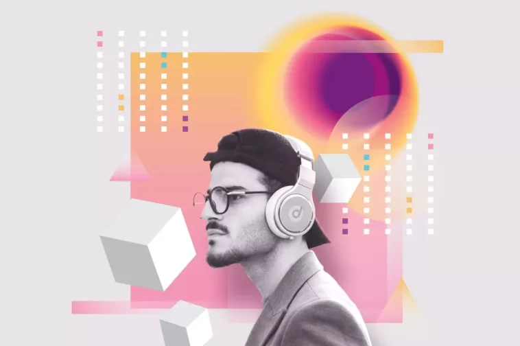
2. Semi transparent gradients
he Top 5 Gradient Trends encompass Semi-Transparent Gradients. These gradients exhibit a fading effect, featuring a full-color hue at one end and 0% color opacity at the other.
Semi-Transparent Gradients can take the form of Duotones or even three-tone gradients, consistently concluding or commencing with transparency.
HOW AND WHERE TO USE THEM?
One of my favorite ways to use Semi-Transparent gradients is overlapping them with other gradient shapes and backgrounds, or as overlays on the photos. The example below shows an artwork made by Studio-JQ

In this example, we observe the utilization of a Semi-Transparent shape placed over a Three-color gradient circle. The understated Semi-Transparent shape creates a misty aura in front of the gradient circle, resembling a fading moon. It’s a straightforward yet impactful application of the transparency effect.
Another fantastic use of Semi-Transparent Gradient Trends mixed with photography and textures can be seen on the poster artwork made by Magdiel Lopez.

NEED PREMADE RESOURCES?
Semi-Transparent Gradients can also be found in my GenX Abstract Gradient Shapes Toolkit, just make sure to open them with Illustrator CS4 or newer, the semi gradient effects are not compatible with EPS10. However if you are not using Illustrator, there is a high res PNG images available in the pack which can be used with any photo editing software. The example I made that uses the Semi Transparent Gradients from the GENX Toolkit can be seen below.

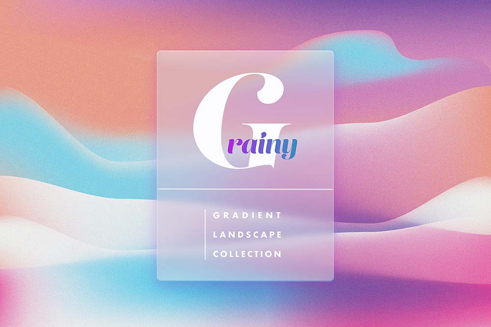
3. Mesh gradients
Mesh Gradients are gradients crafted using the mesh tool in Illustrator, as suggested by the title. Creating this type of gradient demands a higher level of skill. Generally, they blend multiple colors together, requiring careful consideration as not all colors harmonize effectively. Additionally, the amalgamation of multiple colors generates a textural pattern reminiscent of liquid, imparting a dynamic appearance to the gradient.
By now, you may have observed the seamless compatibility of gradients with black and white photos, imparting the necessary contrast to amplify their color intensity. This combination not only enhances the visual appeal but also eliminates clutter, preventing the sense of “too much going on” in your design.
HOW AND WHERE TO USE THEM?
Mesh Gradients can serve as stand-alone patterns. Due to their frequently dynamic appearance, they work well as minimalistic patterns when paired with creative typography.

The use of Mesh gradients for branding purposes is also getting more popular. This type of use can be seen on the minimalistic branding project below, made by Focus Lab.

NEED PREMADE RESOURCES?
If you need a premade Mesh Gradient backgrounds, look no more. Holographic Gradients is a huge collection of 60 gradient backgrounds that will help you in your design work.

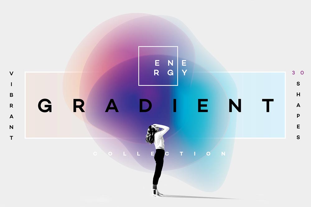
4. Gradient blurs
This is where things get interesting….introducing Gradient Blurs! I am sure you have seen these around, funny looking fellas that have a strong “artsy” feel. They are now a part of the Top 5 Gradient Trends.

HOW AND WHERE TO USE THEM?
They are frequently incorporated as elements in poster designs. The beauty of their abstraction lies in their ability to convey a range of emotions and abstract concepts. Whether depicting sound, light, the universe, happiness, or sadness—many of these elusive ideas can be effectively communicated through a thoughtfully chosen, blurry colored shape.
Let`s see some of the examples that use Gradient Blurs:

NEED PREMADE RESOURCES?
Creating Gradient Blurs can be challenging; they represent a form of experimental artwork. The collection I assembled was part of an experimental project that involved numerous unsuccessful attempts at shapes. However, it also yielded a multitude of intriguing and creative forms, many of which were ultimately included in the final pack. If you need premade designs, check the Vibrant Gradient Blurs collection.
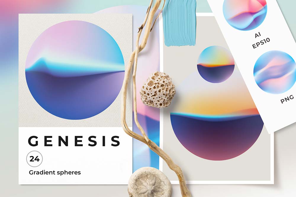
5. Gradient spheres
The last Gradient Trend are Gradient Spheres, meshed circles that have a strong three-dimensional form, reminding us on planets and bubbles.

HOW AND WHERE TO USE THEM?
Gradient Spheres have found their place in application and web designs among other uses. Because of their resemblance to planet like objects they are often used in a techy- futuristic type of projects. For example Jiyoon Kim used Gradient Spheres to design a creative Watch UI that has a light futuristic touch.

Another creative example of Gradient Sphere used in poster design made by Mirtho Prepont for Asana
NEED PREMADE RESOURCES?
Gradient Spheres Collection has a set of lighter pastel colored spheres as seen on the example below. Depending on your project you will decide which set works best for you.

Hopefully, this selection will help you in your creative work, if you have any comments feel free to leave them below!
One Comment
One Ping
Pingback:Xu hướng Gradient 2020: Sử dụng màu sắc hiệu quả và sáng tạo